
Australian Wren


Wabi Sabi
Recently on one of the sunny pre-spring days we have been enjoying I went for a "wabi sabi walk". Just to explain myself in very simple terms, wabi sabi is a Japanese aesthetic which celebrates the old, the worn, the ethereal and the impermanent. It is the acceptance and enjoyment of the imperfect and the transient, and the celebration of aging and the ensuing marks of age and patina. It is finding beauty in humble everyday things or things which may even be broken or damaged. Wabi sabi reflects beauty which may not be what is the commonly accepted ideal. I have realised that this aesthetic is one which I have loved ever since I was very young but I never knew it had a name until a few years ago.
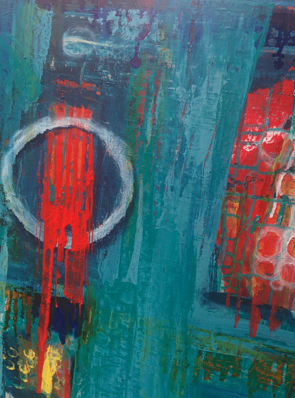
Serena Barton is an artist who incorporates wabi sabi into her work as inspiration she suggests going outside for a wabi sabi walk. The idea is to look for wabi sabi elements which you may not normally take much notice of. I was astounded to see how much inspiration there was within a few hundred metres of my home. Texture and worn out beauty everywhere. It inspired me to paint a large abstract expressionist painting for my home. I found it liberating and so enjoyable to create texture and to allow the painting process determine the outcome. These are some of the images I collected around my streets followed by the painting I did.






Serena Barton is an artist who incorporates wabi sabi into her work as inspiration she suggests going outside for a wabi sabi walk. The idea is to look for wabi sabi elements which you may not normally take much notice of. I was astounded to see how much inspiration there was within a few hundred metres of my home. Texture and worn out beauty everywhere. It inspired me to paint a large abstract expressionist painting for my home. I found it liberating and so enjoyable to create texture and to allow the painting process determine the outcome. These are some of the images I collected around my streets followed by the painting I did.
The following 2 images are part of the larger painting I mentioned which is still a work in progress. Strictly speaking the colour palette for wabi sabi should be more earth tones but it was the aged look and texture I was focused on.
A Nice Surprise
Thanks so much to This Enchanted Pixie for including "Wise little Owl" in her gift suggestions for children. Check out her lovely Blog full of great ideas!
It is so lovely to know that somebody on the other side of the world has seen Little Owl and liked him! The internet is amazing isn't it!

It is so lovely to know that somebody on the other side of the world has seen Little Owl and liked him! The internet is amazing isn't it!

The art of randomness
Is randomness a real word? I am not sure, but it describes what I would like to think about today.
One of my favourite processes to get my imagination working is to make random scribble drawings and develop them. There are no preconceived ideas when I begin. I simply draw a whole bunch of scribbles on the surface on which I am working. The original inspiration was from Carla Sonheim's idea of looking at sidewalk cracks and making pictures from what you see. I then started seeing creatures everywhere, on my wooden floors and on the ceilings...no I promise I am not crazy!! It is particularly weird if you are in somebody else's house and you see a cool creature in their floorboards and you want to draw it. Come on! I know I am not alone in this!!
Here is an owl from my kitchen floorboards. I hope you can see him too!

And another cute little floorboard face!

After you have made your scribble have a look at what you have drawn. I find the best scribble drawing is one where you are mindful of how your pen or pencil has been moving, draw slowly but don't over think it. Make varied marks. rounds curly ones, square ones, zig zags. The following drawings are examples from my sketchbook. The first one shows the scribble and what I found within it.Of course you can add lines if you want to, this is only a starting point.

The drawings are then further developed as you like.


I enjoy looking for characters in my scribbles and love it particualrly when there are a whole host of weird
and wacky findings in one drawing. I just finished a set of ACEO's which are 3 1/2 by 2 1/2 inches and are full of weirdness! It was really fun and challenging doing it in such a small space and trying to create a unity of composition and meaning. They will be heading to my Etsy Shop shortly.

This is a great project for children when you are trying to amuse them and have no resources.
Have fun discovering the weird within the random!
Ironically when writing this, the tree outside my studio fell down...how random!
Monty the cat lost one of his nine lives.


One of my favourite processes to get my imagination working is to make random scribble drawings and develop them. There are no preconceived ideas when I begin. I simply draw a whole bunch of scribbles on the surface on which I am working. The original inspiration was from Carla Sonheim's idea of looking at sidewalk cracks and making pictures from what you see. I then started seeing creatures everywhere, on my wooden floors and on the ceilings...no I promise I am not crazy!! It is particularly weird if you are in somebody else's house and you see a cool creature in their floorboards and you want to draw it. Come on! I know I am not alone in this!!
Here is an owl from my kitchen floorboards. I hope you can see him too!

And another cute little floorboard face!

After you have made your scribble have a look at what you have drawn. I find the best scribble drawing is one where you are mindful of how your pen or pencil has been moving, draw slowly but don't over think it. Make varied marks. rounds curly ones, square ones, zig zags. The following drawings are examples from my sketchbook. The first one shows the scribble and what I found within it.Of course you can add lines if you want to, this is only a starting point.


The drawings are then further developed as you like.


I enjoy looking for characters in my scribbles and love it particualrly when there are a whole host of weird
and wacky findings in one drawing. I just finished a set of ACEO's which are 3 1/2 by 2 1/2 inches and are full of weirdness! It was really fun and challenging doing it in such a small space and trying to create a unity of composition and meaning. They will be heading to my Etsy Shop shortly.

This is a great project for children when you are trying to amuse them and have no resources.
Have fun discovering the weird within the random!
Ironically when writing this, the tree outside my studio fell down...how random!
Monty the cat lost one of his nine lives.


Little Angel
This little angel was standing on a pile of rubble behind a fence in Port Adelaide.
The image seemed symbolic of hope to me.

The image seemed symbolic of hope to me.

A is for ..........
The illustrated alphabet is perhaps something which we have all encountered as children, that is letters of the alphabet illustrated to tell a little story about the particular letter.
Recently I have challenged myself to start working through some letters to create an illustrated alphabet of my own.
So far I have worked on "F is for flowers"

"B is for beard of Bees,"

and, as I shared in my previous post "Q is for Quinoa"

Recently I have challenged myself to start working through some letters to create an illustrated alphabet of my own.
So far I have worked on "F is for flowers"

"B is for beard of Bees,"

and, as I shared in my previous post "Q is for Quinoa"

United Nations International Year Of Quinoa Stamp Design
At the start of the year I was one of some recent graduates of UNISA who submitted designs to commemorate the United Nations International year of Quinoa. The aim was to promote quinoa as a super food as it is jam packed full of nutrition and also to honour the custodians of the grain, the Andean peoples who have grown it for thousands of years.
This was the rationale for my design:


My design was one of the 8 shortlisted and because of this we got the opportunity to go to Government House in June and receive a certificate from the His Excellency the Governor of South Australia, Rear Admiral Kevin
Scarce.
Recently were were invited to the UN Annual Dinner at the beautiful National Wine Centre in Adelaide to see which designs had been made into stamps and happily all of them were!
The stamps are only available on a limited release through the Adelaide Office of the United Nations. 57/81 Carrington Street, Adelaide SA 5000
We discovered that even though we all thought we were pronouncing quinoa as keen-wa we were wrong. The Chilean musicians attending the dinner told us it was actually pronounced keen-o-a. Glad we got that sorted out.
This was the rationale for my design:
"This design connects with the origins of quinoa as a food from the Andean region where it was known as the "queen of the grains." I felt it was very important to acknowledge the indigenous nature of the quinoa and the region it traditionally comes from as people are very dependent on it's production for their own food source and it has been given to the rest of the world from there.
I have represented my idea of an Incan sun wearing a head-dress which is made up of sun-rays and also the quinoa seed- head/plant. The face of the sun looks benign rather than fearsome to represent the health-giving quality of quinoa. The face could be construed as male or female in which case it could be seen as a queen (as in "queen of the grains").
The sun face is shaped as a "Q". The name quinoa is often mispronounced (the name sounds like it starts with a "K) so I wrote "Q" is for Quinoa on the head-dress. This gives authority to quinoa as it now becomes the word associated with the letter "Q".
The image and the colours are very bright and graphic as the image needs to be read easily when it is small. Blue represents clear Andean skies.
The letter "Q" is filled with seeds/grains of quinoa in lots of different colours as the plant colour is very diverse and colourful."

 |
| ideas about composition |


colour ideas

final rendering
My design was one of the 8 shortlisted and because of this we got the opportunity to go to Government House in June and receive a certificate from the His Excellency the Governor of South Australia, Rear Admiral Kevin
Scarce.  |
| colour ideas |
 |
| final rendering |
Recently were were invited to the UN Annual Dinner at the beautiful National Wine Centre in Adelaide to see which designs had been made into stamps and happily all of them were!
 | |
| This is my design. |
We discovered that even though we all thought we were pronouncing quinoa as keen-wa we were wrong. The Chilean musicians attending the dinner told us it was actually pronounced keen-o-a. Glad we got that sorted out.
Subscribe to:
Posts (Atom)